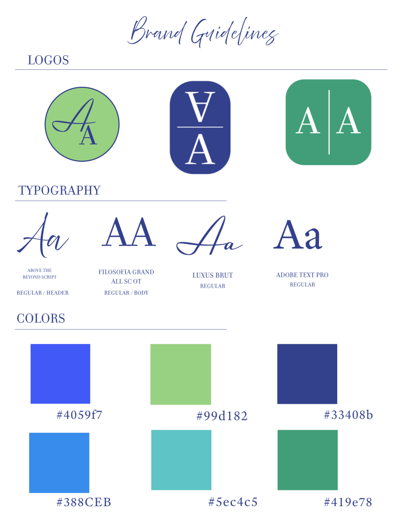
My objective and overall goal for this branding sheet was to use design elements, learned in a design class, to portray my own self-view. I aimed to reach a balance between professionalism, bold, and bright design aspects that reflect my personality. That being said, I chose to use navy blue as my basic dark. Navy is classic, clean, and strong. It pairs well with the different shades of green I used to symbolize growth, freshness, and opportunity. In terms of typography, I chose one that seemed personal and almost handwritten because to handwritten letters are more personal and heartfelt felt which is reflective of my intentionality. I also included an all-caps typography because to me, it symbolizes order and uniformity, which is something I personally value. I wanted to illustrate a consistency that reflects my dependability, but also a bright and fresh color palette that reflects my friendly personality.
Visual Biography
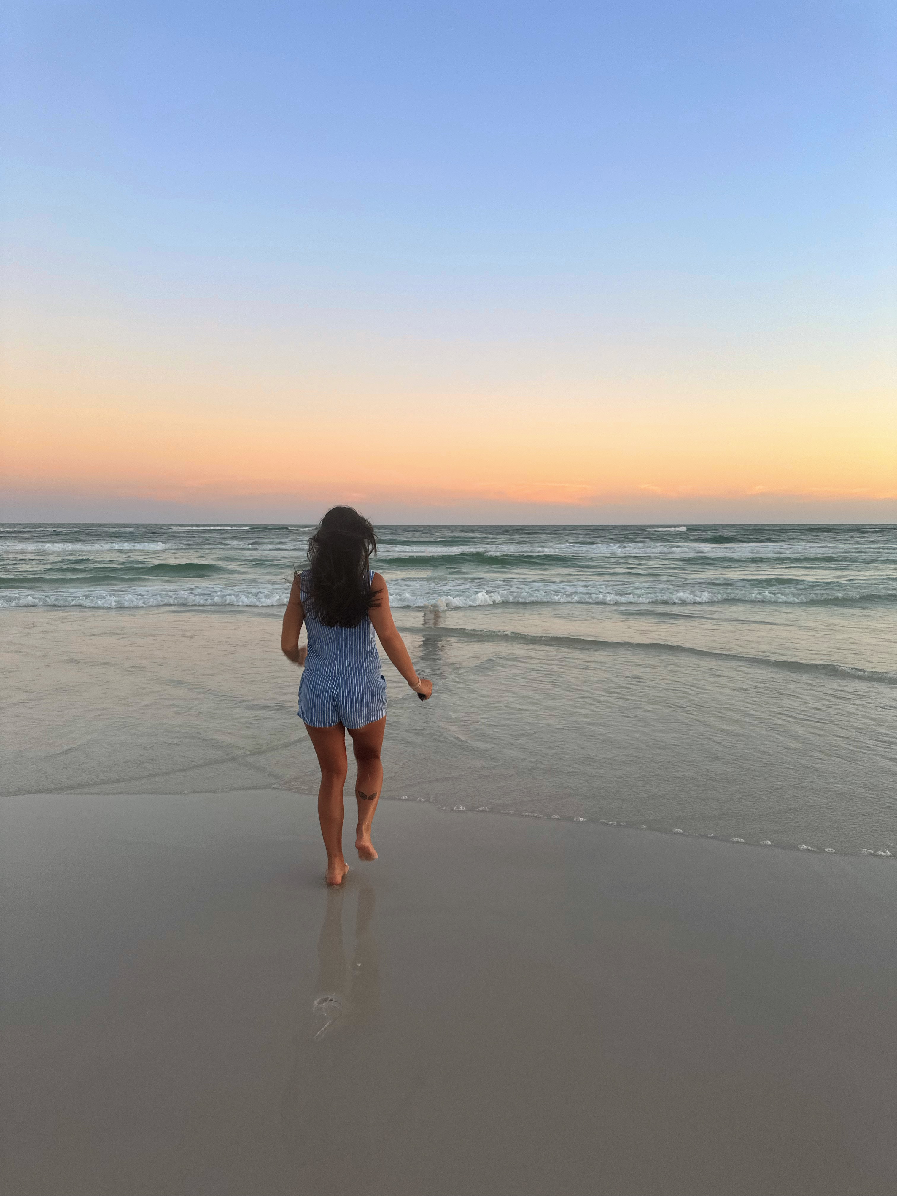
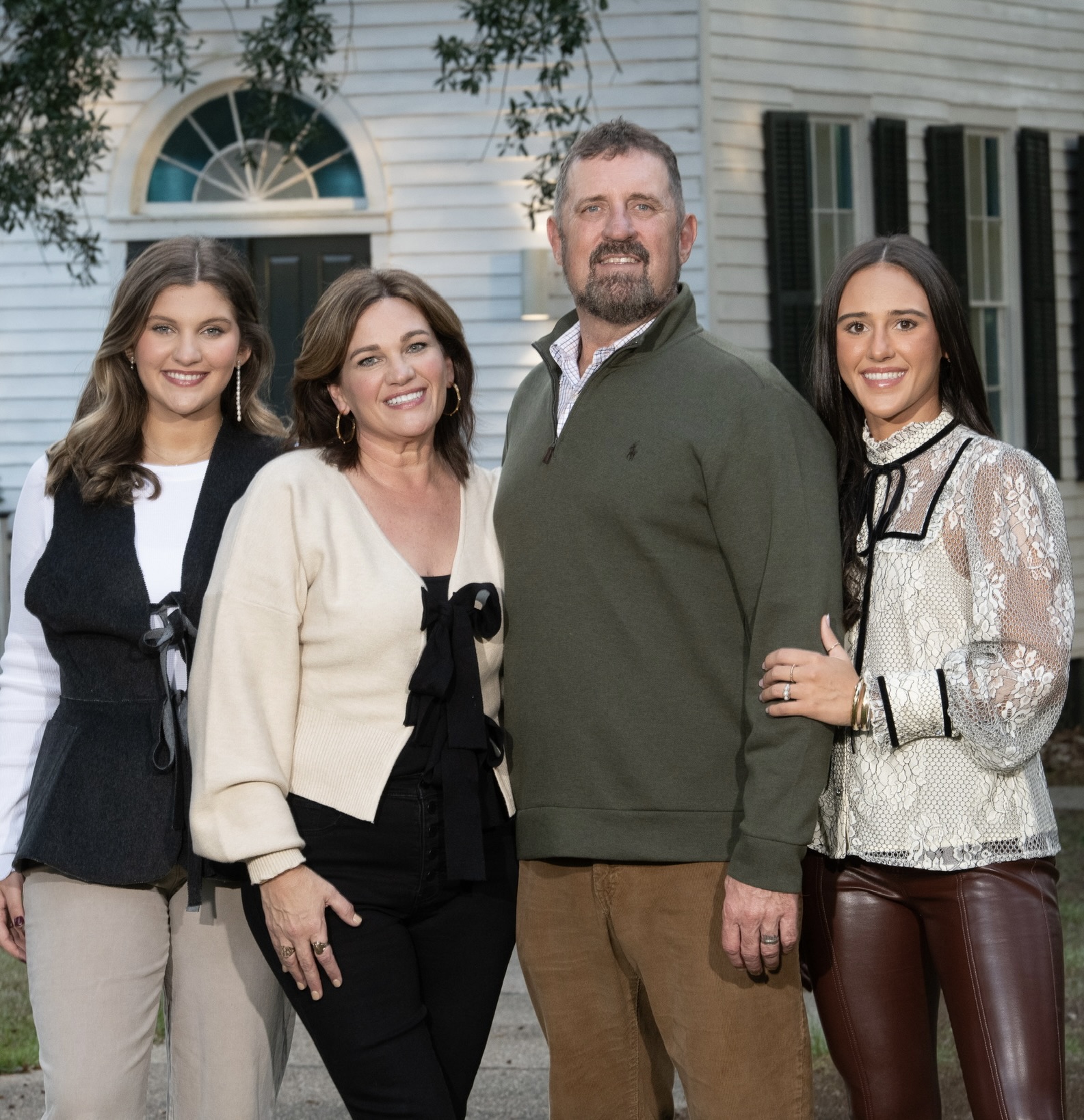
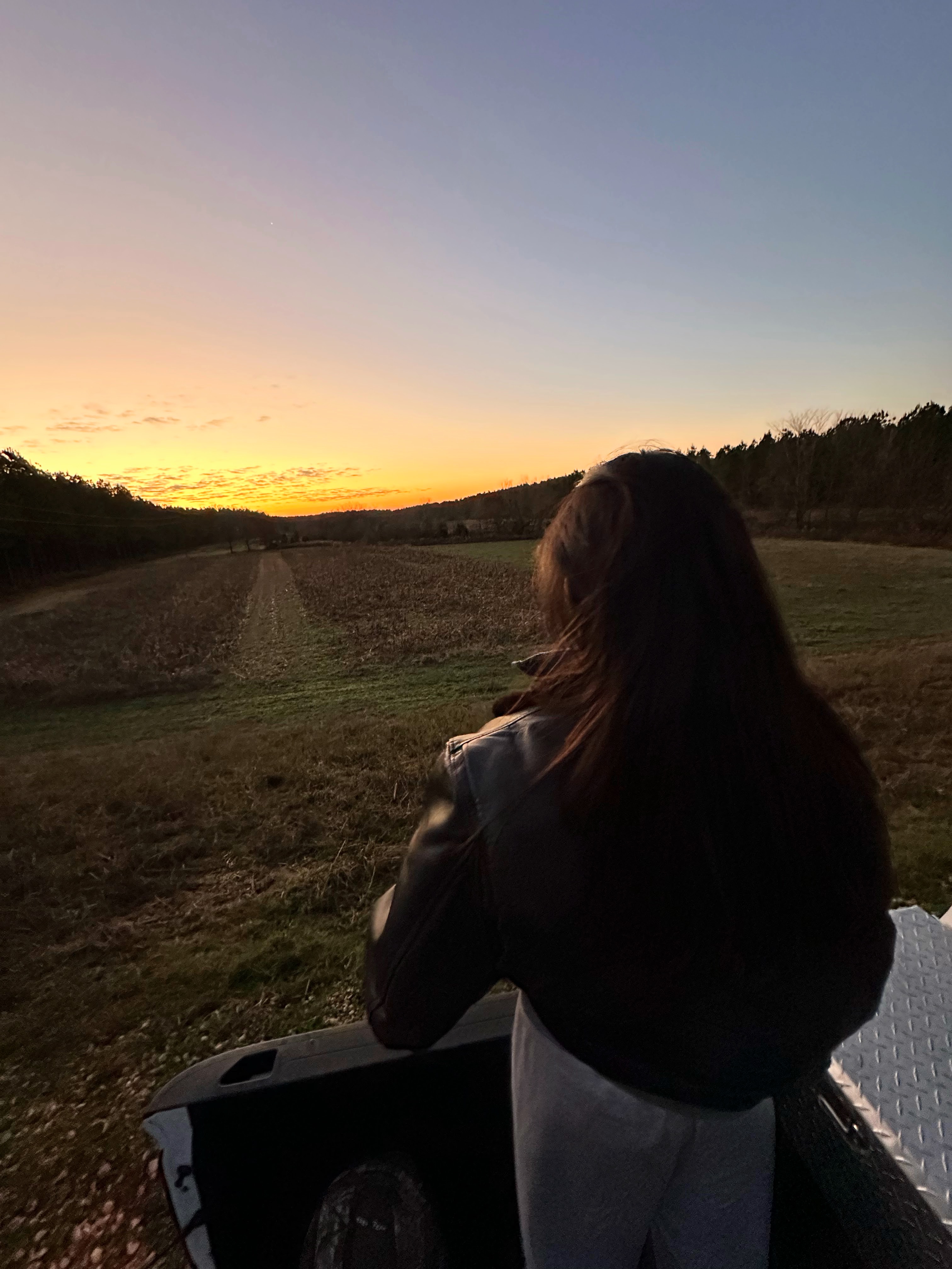
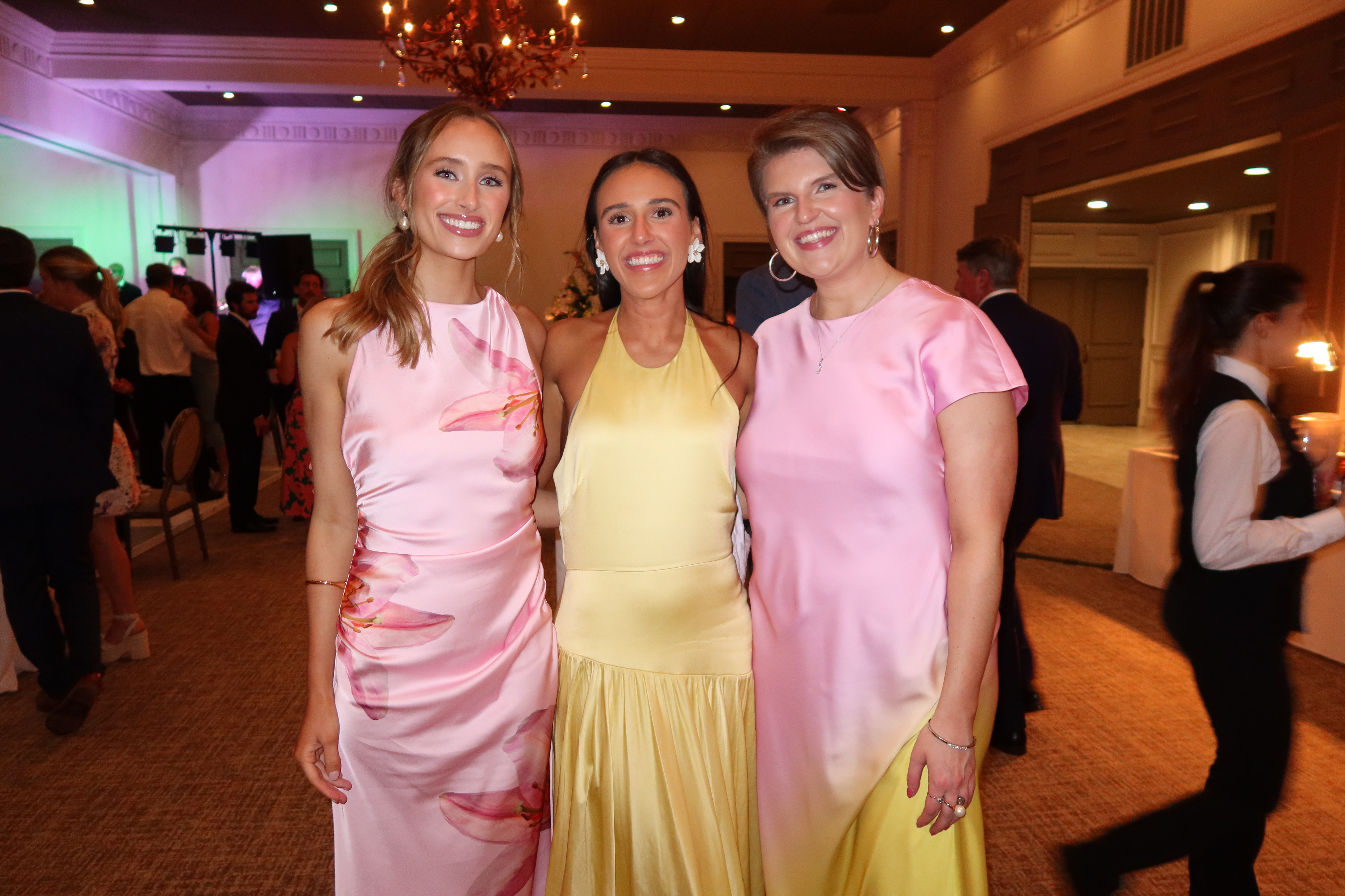
These photographs encompass my passions and the people who make me who I am. These are all very reflective of my joy for people and love of nature. While I don’t think personality, life challenges, adventures, and opportunities can all be displayed and made into a single photo collage, these are the ones that best reflect me. My mission in life is to cherish and love those around me. These images illustrate my willingness to embrace the beautiful chaos of life.